Web design · brand systems

Making three organizations feel like one.

Three Asheville organizations in Chinese medicine, a graduate college, its teaching clinic, and a charitable foundation, share people, a building, and a mission, but read online as three unrelated brands. One design language ties them together. A distinct accent keeps each mission's voice.

3
Organizations
1
Shared system
24
Pages
Live
All three
01

Learn, heal, give.

how they connect

Not competitors, one community seen from three angles. The college trains practitioners. The clinic treats the region and teaches students on real patients. The foundation funds the free care and scholarships that make both possible. Now they share a design system too.

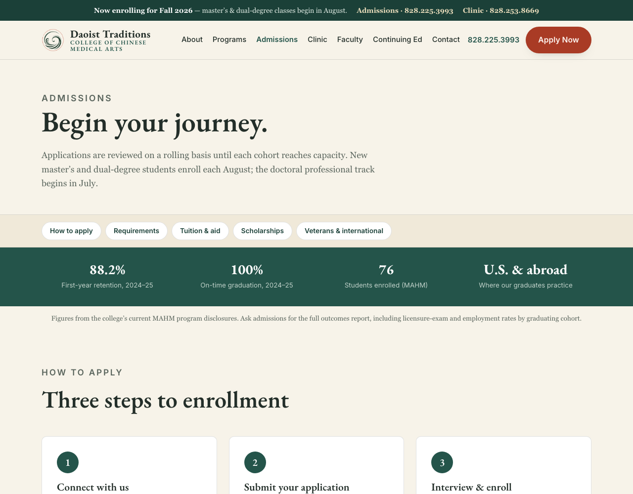
Daoist Traditions College of Chinese Medical Arts
Trains the next generation of practitioners.
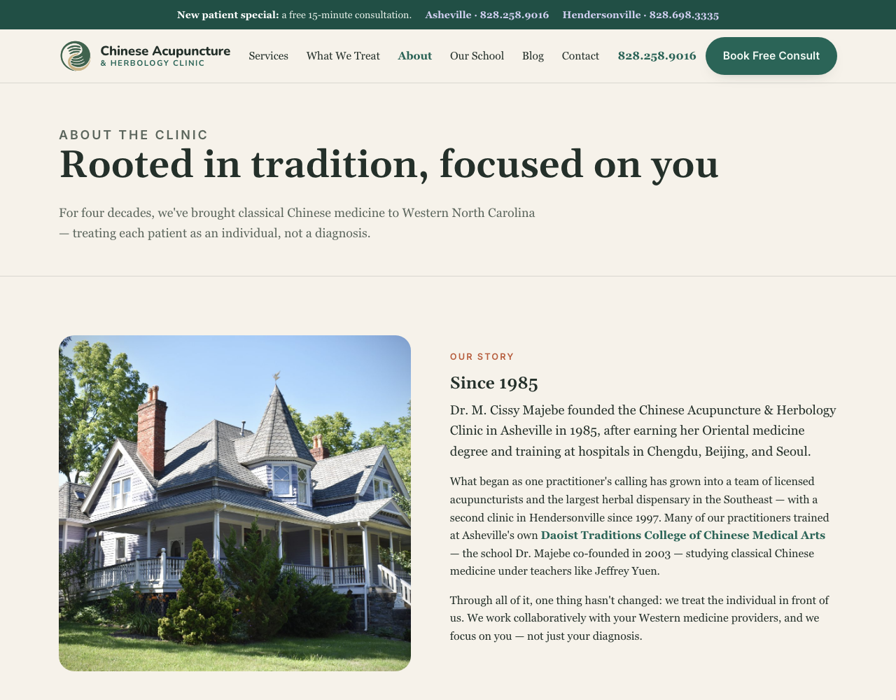
Chinese Acupuncture & Herbology Clinic
Treats the region and teaches students on real patients.
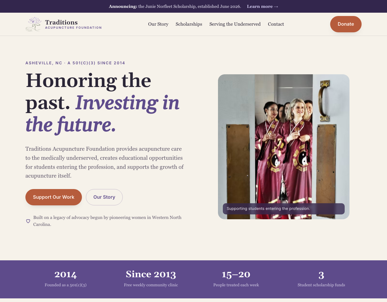
Traditions Acupuncture Foundation
Funds the free care and the scholarships that make both possible.
02

The three redesigns.

same DNA, own voice
03

What makes them feel like family.

the connective tissue

The resemblance isn't an accident. Every site is built from the same small kit of decisions, so a visitor moving between them feels one brand while each mission still stands on its own.

One palette, three accents

Warm paper and a deep ink shared by all three, then a signature accent per org. A shared clay and jade recur across sites to tie the family together.

The hero formula

An uppercase kicker, a serif headline with one italic accent phrase, a warm paragraph, two buttons, and a checkmark trust line. Same rhythm every time.

Botanical logo lockups

An illustrated mark (a swirl, a lotus) beside a two-line wordmark: serif name over a small-caps descriptor. Distinct art, identical structure.

One grid and kit

A single 1160px container, one radius and shadow scale, one set of button and card components. Build one, get three.

Shared
College
Clinic
Foundation
04

The details that do the work.

UX decisions

One primary action per site

Book (clinic), Apply (college), Donate (foundation). A visitor never has to guess the next step.

Accessible mobile nav

A real hamburger with aria-expanded, keyboard reachable, not a decorative icon.

One-tap booking

The clinic's consult button opens Calendly inline. No phone tag to get started.

A cross-linked ecosystem

The clinic's "Our School" goes to the college; the college sends people to the teaching clinic; the foundation supports both.

Editorial warmth

Serif headlines and a paper palette make healthcare feel human, not sterile.

The result is one design language across three organizations, each keeping its own voice. The scarce part wasn't the CSS. It was deciding what should feel the same across all three, and what should feel different. That is the whole job.